The key to getting more traffic in your showroom and selling more cars is following up with more leads. And the key to following up with more leads is having more leads to follow up with in the first place.
Unfortunately, most websites in the automotive industry are not properly optimized to collect leads.

They dump customers on webpages that aren’t equipped to turn that customer into a lead. What’s worse is that they often confuse customers, which means they leave the site and rule out that dealership altogether.
A good landing page not only captures leads but also connects you to the real person on the other side of the screen who wants to buy a car. By capturing their information, you gain the opportunity to start a conversation with them. And through these conversations, your team has the opportunity to build meaningful relationships that lead to sales. That’s why a good landing page is so important.
In fact, with an effective landing page, your website could generate hundreds of easy leads for you—doubling not only your current lead count but also your sales.
We define a lead as a name, email and phone number—exclusively.
If a marketing company is trying to sell you page views, click-throughs or any other useless metric as a lead, run for the hills. The goal is to be able to get through to the customer. And these “metrics,” without contact information attached, won’t do that. At least not at a reliable rate.
Here are a few simple tweaks you can make to your landing page to collect more leads and sell more cars today.

#1: Tell Users Where They Are
As a consumer, there’s nothing more frustrating than being dropped on a page without any indication of why you’re there and what you’re supposed to do.
Honestly, if a customer ends up on a landing page and isn’t sure what they’re supposed to do, they’ll probably just leave, or “bounce” back off the page.
Not only should you be clear about why customers are on the landing page, but you should always state what they’re going to get out of giving you their information. Whether they’re going to receive access to your inventory, a phone call from your staff, more information about your dealership or a special offer, make sure these expectations are clear on your landing page. By giving them something of value, you easily bypass the knee-jerk reaction that they don’t want to put in their information.

#2: Keep It Visually Interesting And Simple To Read
Think of your webpage like the cover of a book.

While it’s true we shouldn’t judge books by their covers, let’s be honest, we all do. Make sure your landing page has bright, appealing and coordinating colors.
But the design shouldn’t work alone. The writing on your webpage should be clear, concise and written at a middle school reading level. When you use a simple writing style, visitors can easily identify your call to action and understand what they’re supposed to do on the page.
#3: Have A Single, Clear And Direct Call To Action
When a customer lands on your page, you have a short amount of time to hold their attention, often only 10-30 seconds.
And if your page is too busy, confusing or has too many calls to action, customers will get confused, and instead of interacting, they’ll just leave.
Keep your page simple. Give customers one task to do and make doing this task simple and easy to accomplish.
When this one task is filling out a form, make sure the form is as short and simple to fill out as possible. Fewer form fields will reduce customer confusion and friction, resulting in more completed form submissions for you.

#4: Limit The Number Of Form Fields
Like we said before, people don’t like long or complicated processes. Keep your form short and only ask for information you truly need.
A name and phone number is all you need to get the conversation started with the customers. Once you have them on the phone, you can start asking all the other follow-up questions about credit and car preferences. But keep your form as simple and easy as possible.
We typically also request email because if you can’t get them on the phone, email can be a way to start a conversation that eventually leads to a phone call or appointment.

#5: Have A Multi-Step Submission Process
We know that sometimes you do need more than the basic information of name, email and phone number.
But just because you need more information doesn’t mean people will be more willing to fill out a long form.
In cases where you need customers to fill out more information, consider using a multi-step submission process. Make the first step short, consider just asking for their name and phone number. Once they fill out this information you can bring them to the full form.
By using a multi-step submission, you reduce the number of people who skip your form because it’s long. Get customers to fill in one or two simple answers, and once they’ve submitted that information, land them on the longer form. Human psychology and drive to finish what they’ve already started will push them to finish the form.

#6: Use Creative That Creates Scarcity, Urgency, And Believability
“I’ll do it later,” is the lie every customer tells themselves when faced with something they don’t want to do, like submit their contact information.
But let’s be honest, once a customer decides to leave your page, they’re probably not coming back to “do it later.”
If you want customers to fill out your form, then you need to give them a reason to do it right now. You need customers to see your page and feel like they’ll miss out on something if they don’t fill out the form immediately.
You convey this feeling by including scarcity, urgency and believability on your page. Present an offer that is not only limited in time but also limited by the number of customers who can use it. Finally, this offer, along with its urgency and scarcity, should be believable—otherwise, customers will call your bluff and return to the “I’ll do it later” mindset.

#7: Don’t Have Page Navigation

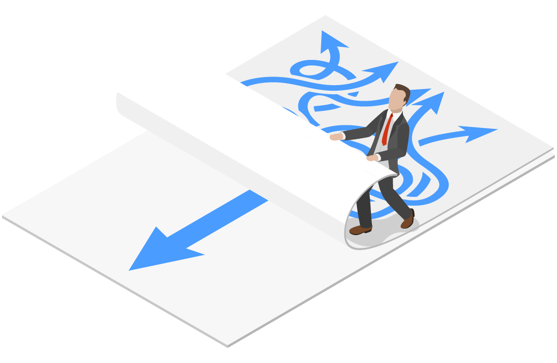
Keep things simple. When you give customers more options, they’re less likely to do what you want them to.
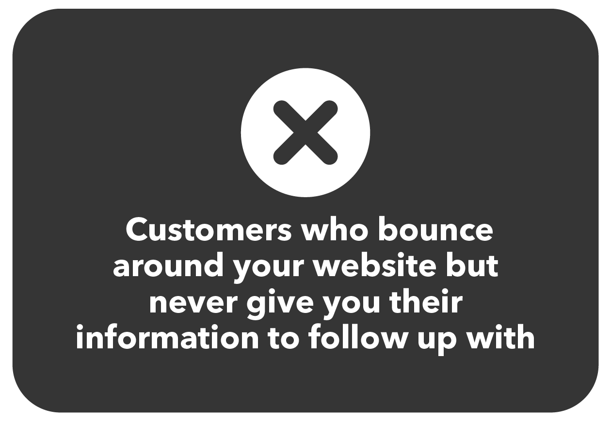
If you give customers the option to bounce to another page within your website instead of giving their information, they’re going to take it.
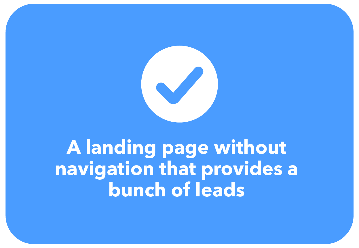
Remove the temptation to bounce to another page by removing site navigation from your landing page. At the end of the day, we want to help these customers drive new vehicles, but we can’t do this when they bounce off the website before submitting their information.
Which would you rather have:


#8: Understand That Every Page Isn’t A Landing Page
Some marketing companies will track views and clicks on every page of your website. But just because you have pages that people can land on, does not make every page a landing page. Likewise, just because you can track the views and clicks doesn’t make the page a good landing page.
A landing page should be optimized to collect leads. That means if a page isn’t collecting a name and phone number at the bare minimum, it’s not a landing page and shouldn’t be used as such. Don’t make the mistake of paying to direct traffic to a page that won’t convert, like the home page of most dealership websites.
#9: Focus On The Benefits Of Your Dealership, Not The Car
The average car buyer will do 15 hours of online research before purchasing a car. Unfortunately for you, that means your dealership is probably just one of the dozens they encounter on their path to finding their new car.
And while you might think your dealership is special and better than your competition, to a customer, most dealerships all look the same and provide the same service. And when every store provides the same service, they’re just going to pick the one that’s most convenient and offers what they want at the cheapest price.
Instead of focusing on cars, show customers why service at your dealership outweighs any experience they would receive at another dealership.

#10: Track Everything
The only way to know if your landing page is working effectively is through tracking and reporting.
You should be tracking how many people visit your page, how long they stay, how many submit their information and from these submissions how many you’re able to sell.
In tracking, you may find that not many people are submitting information. This doesn’t mean a landing page won’t work on your website, it means your landing page doesn’t align with the 9 tips we’ve outlined in this eBook.
Evaluate how efficiently you’re executing each tip and make small changes. But any time you make a change, test for effectiveness. Tests without data to back them up are just shots in the dark. You could end up making a change that destroys your results and never be the wiser.
In conclusion, an effective landing page can DOUBLE your current leads and help you sell more cars immediately.
We know this landing page stuff may seem a little tricky, but when it’s done right, you have the potential to make a massive, positive impact on your bottom line.
Plus, collecting leads is better for not only your business, but for your customers too. When your team “works” a lead, they are building a relationship with the customer. They are creating a genuine, human-to-human connection and helping guide the customer through what, for many, is an intimidating and confusing process. If your staff is caring and helpful, customers will appreciate being guided through the car-buying process. Collecting leads is a win-win opportunity.
We’ve perfected the formula and help dealers across the country generate more traffic, leads and sales. Tips for generating leads from a landing page is really only the tip of the iceberg. To learn more about how you can put sales on autopilot and start having fun in the car business again, click here to sign up for a free demo.

